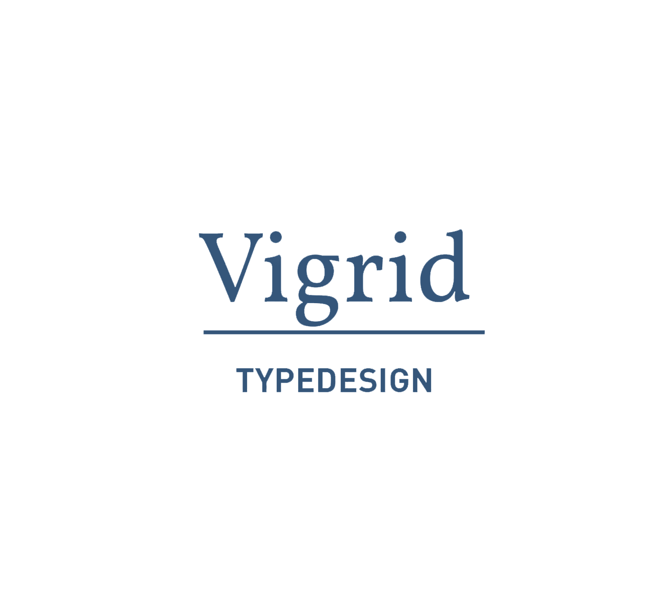
The Vigrid is a modern Renaissance Antiqua, which is based on the Folkwang Antiqua by Hermann Schardt. Hermann Schardt was a painter and freelance graphic designer. In 1948 he was appointed to the Folkwang School of Design to rebuilt, since this time he served as director and helped to international fame.
His font is heavily influenced by calligraphy and is characterized by very long-draw, delicate serifs and beaks that evoke the shape spectrum of Art Nouveau. After setting of the character set in the hand set and the subsequent digitalisation, I start the principle of my argument.
Unusual at the Folkwang typefaces are characteristics that are more likely assign italic, such as single-storey "a", the two-storey "g" and the form of the "k" and the very heavily inclined summetry axis. But Schardt uses these characteristics to its craned typeface. This provides a good approach for a modern concept, as well as the lowercase f, j and &. Whose forms I have edited and transfered to serifs and beaks.
The eccentric expression of the beaks and spurs were taken back for the sake of modernity. It followed a more round, more readable font, which nowadays can apply again.
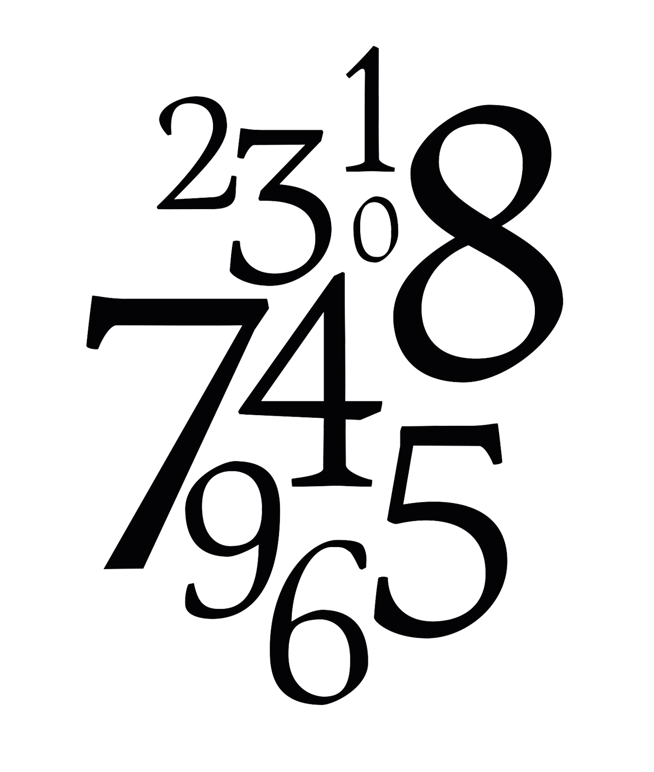
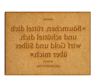
The Vigrid is designed to be reading scripture, but can also used as a headline font. Other features of the Vigrid are the high x-height, the asymmetrical serif and the stroke contrast which reveals the pointed nib well. The font is currently still in process. The character set consists at present 130 character. The name comes out of the Nordic Mythology were there is Vigrid another mystical place, next to Folkwang.
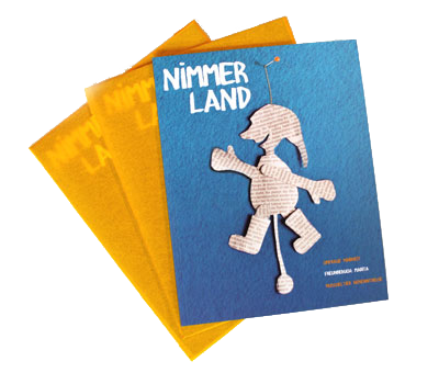
Photos by Natascha Dell, Georg Schreiber