When we are looking for butter on the cooling shelf, we usually see heaps of golden wrapping with cows, green meadows, and milk bottles. Producers show “we also do butter”. However, packaging can present much more than just one of many products placed next to each other or drawing our attention to the lower number in calories compared to others.
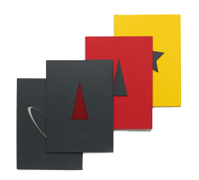
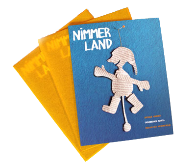
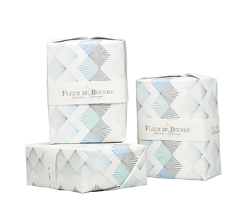
Butter – because of its form and texture – was found to be the ideal product for a packaging experiment, which is not set up in the stereotypical way but attracts attention in a different way.
Otherness can discontinue from the product range and point out with his character.
New things and differentiation are attractive and purchasing these attributes creates an added value, perhaps even a desire. The coloration, form and typographies were changeable factors for this project.
For this project I was working under professional supervision of Prof. Thomas Rempen.